Resonata
E-commerce Experience.
I designed Resonata as a conceptual e-commerce experience, shaping everything from the homepage structure to the visual direction and content flow. The project explores how a retail platform can move beyond transactions and become something more immersive, emotional, and lifestyle-driven.
E-commerce Experience Design
UX / UI Design
Storytelling
Visual Direction
| My Role | Scope | Focus | Output |
|---|---|---|---|
| UX/UI & Visual Designer | Homepage concept | Engagement & storytelling | High-fidelity Mockup |
01. Problem
E-commerce that feels purely transactional
Most e-commerce platforms are designed around efficiency, quick navigation, clear pricing, fast checkout. While functional, this often creates a flat experience where users browse with intent, but rarely with curiosity.
There is little emotional engagement, minimal storytelling, and almost no sense of lifestyle or identity. Products exist, but they are disconnected from the context in which they are actually used.
Users can buy — but they are not invited to explore.
Product-first thinking
Weak brand connection
Low engagement
Lack of storytelling
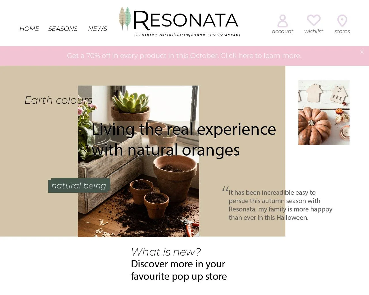
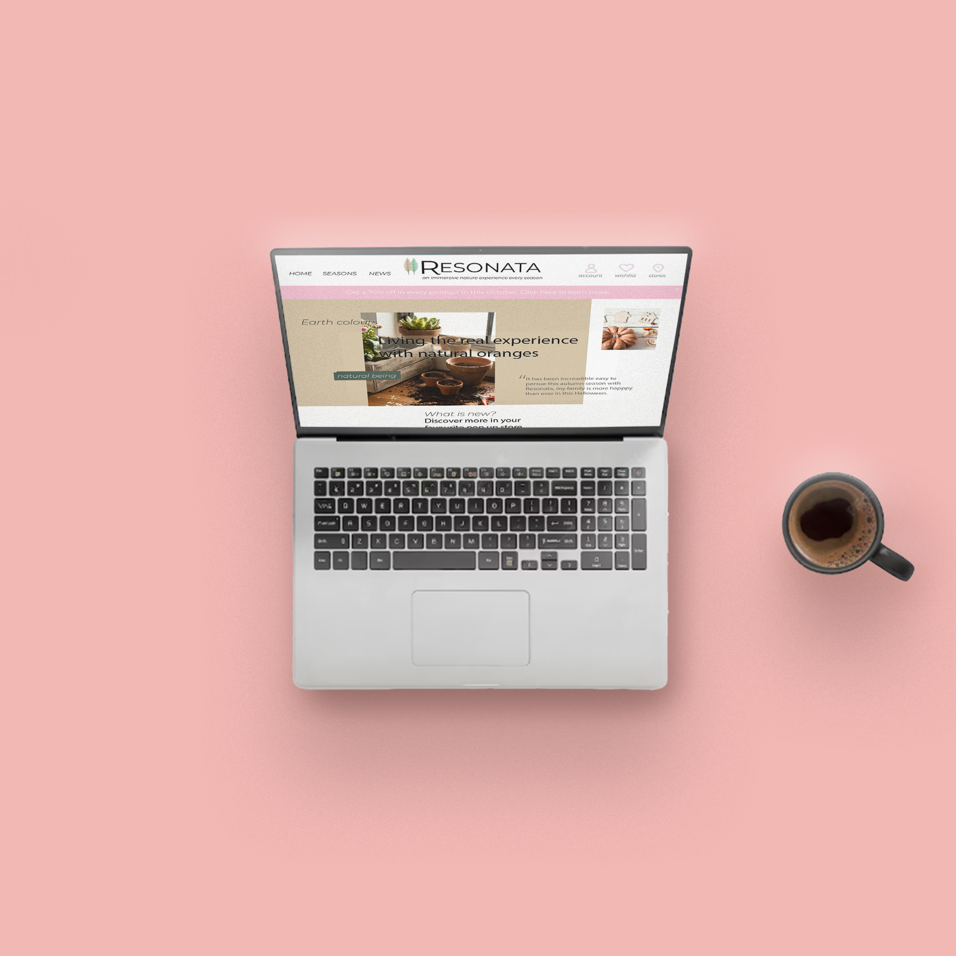
Homepage view.
02.Goal
An experience built around lifestyle, not products
The goal was to rethink the homepage as more than a storefront — designing an experience that encourages users to browse, feel inspired, and connect with the brand before making a purchase.
-
Use imagery and storytelling to build atmosphere before introducing products.
-
Replace rigid navigation with more intuitive, theme-based browsing.
-
Establish a clear visual language that reflects calm, seasonal living.
-
Introduce calls-to-action at the right moment, after inspiration, not before.
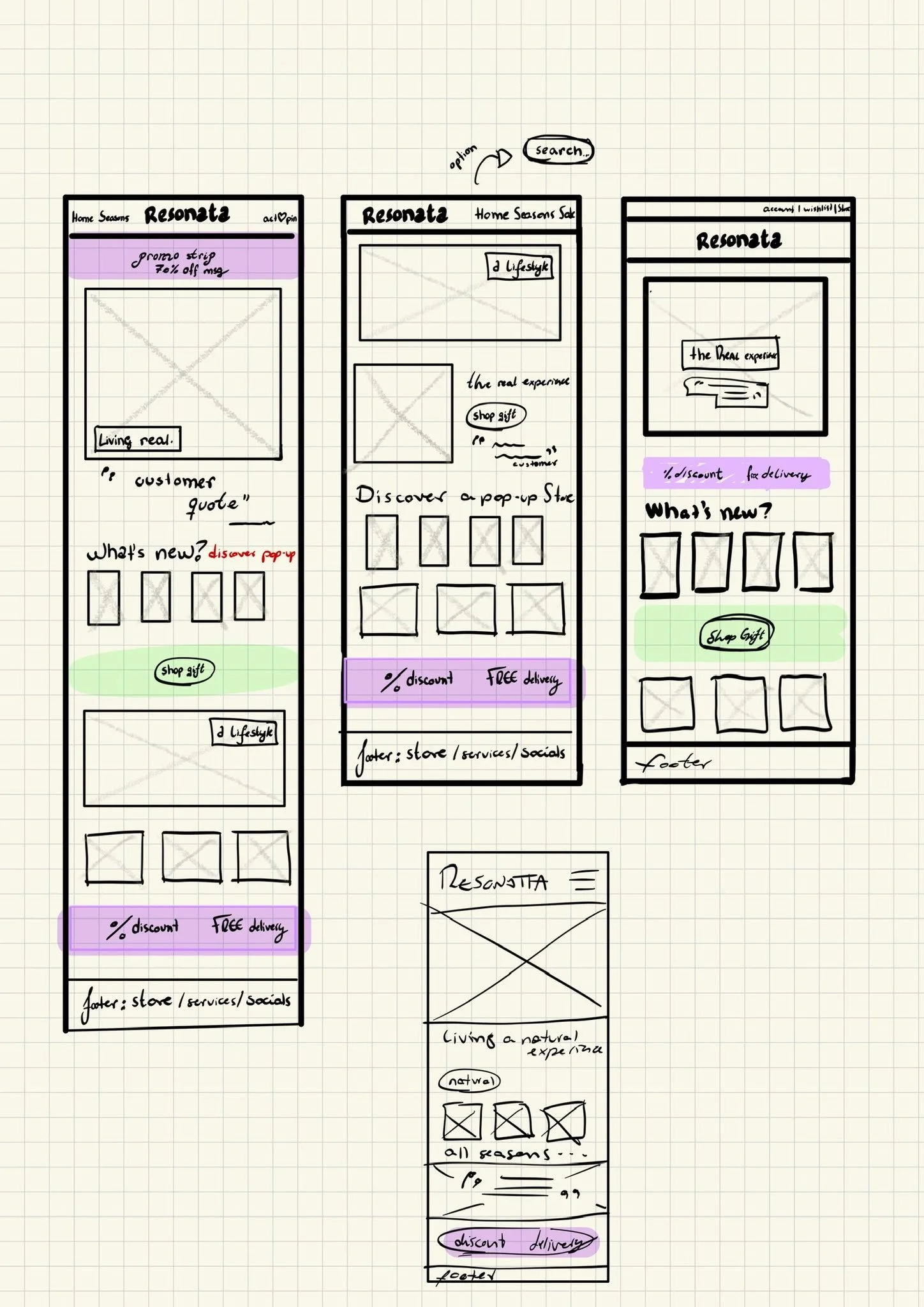
03. Process
Research, architecture, iteration
I approached the design by rethinking how users move through a homepage. Instead of asking “what should we show?”, I focused on “what should users feel first, and when do they act?”
Key Insight
Inspiration should come before interaction, users engage more when they feel something first.
I mapped the page as a sequence: introduction, exploration, transition, and action. Each section has a clear role, guiding users naturally rather than overwhelming them with options.

04. Solution
Seasonal, narrative-driven design
The final design transforms the homepage into a guided experience built around seasonal living. Instead of focusing on products, the interface presents moments, autumn, Halloween, winter, allowing users to navigate through moods rather than categories.
The hero section sets the tone with a warm, lifestyle-driven scene. From there, users move into curated thematic blocks, each acting as an entry point into a different seasonal context.
From product browsing → to seasonal storytelling.
Calls-to-action are placed deliberately after moments of inspiration, aligning interaction with user intent. The experience feels slower, more considered, but ultimately more engaging.
05. Outcome
More engaging, more human
The result is a homepage that prioritizes experience without losing clarity. It balances inspiration and usability, allowing users to browse freely while still guiding them toward action.
✓ A complete homepage concept built around user flow rather than product hierarchy
✓ Stronger emotional engagement through lifestyle-driven design
✓ Improved discoverability via thematic navigation
✓ Clearer brand identity through consistent visual language
✓ More natural conversion through well-timed interaction points
06.Learnings
What this project reinforced
01
Emotion is a powerful entry point. When users feel something first, they are more likely to engage and explore.
02
Navigation doesn’t have to be rigid. Organizing content around themes can feel more natural than traditional categories.
03
Good UX is about timing. When and where you introduce interaction matters as much as the interaction itself.
04
Visual design is not decoration, it shapes perception, guides attention, and defines the overall experience.