Propesq website Redesign.
I designed Propesq end-to-end, every page, the logo, and the pattern system used across the platform. The project brought structure, clarity, and a cohesive identity to a fragmented academic system used by students, PhD researchers, and academic staff.
UX / UI Design
Information Architecture
Website Design
Visual Design
| My Role | Scope | Users | Output |
|---|---|---|---|
| UX/UI & Visual Designer | Full website design | Students & Researchers | Live Website |

01. Problem
A platform without structure or clarity
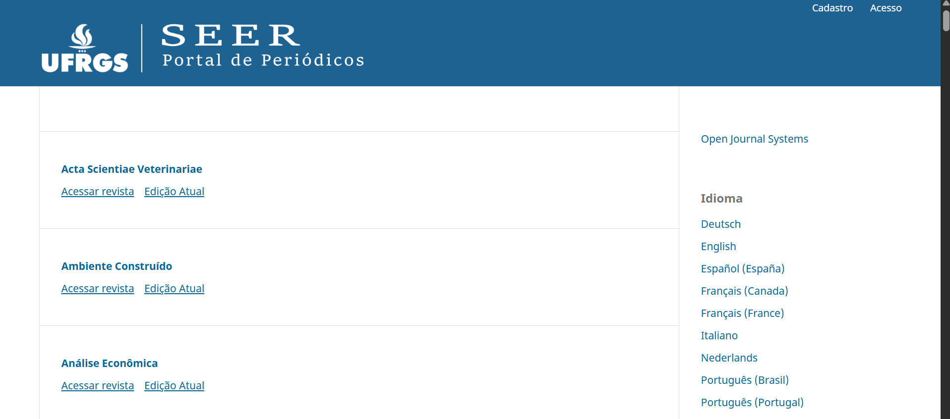
Propesq was the institution's research hub, but in practice, it wasn't functioning as one. Students, PhD researchers, and academic staff needed a single, reliable place to access editais (calls for applications), browse scientific journals, and stay updated with research outputs.
Instead, they faced content scattered across multiple sources, with no visual hierarchy, no clear navigation, and a volume of material — SEER journals, publications, magazines — that overwhelmed rather than informed.
The content existed. What was missing was structure, and that was making everything invisible.
Fragmented sources
No visual hierarchy
Poor navigation
The starting point — the SEER portal, the existing system Propesq was built on top of. The content was there; the structure and identity weren't.
Cognitive overload
02.Goal
One centralized platform for academic discovery
The goal was clear: consolidate everything into a single, structured website that felt trustworthy, easy to navigate, and built around how researchers actually search for content. And not just a redesign, a rethinking of the entire information experience. Instead, they faced content scattered across multiple sources, with no visual hierarchy, no clear navigation, and a volume of material like SEER journals, publications, magazines that would overwhelmed the user rather than informed them.
-
One access point for all journals, editais, news, and publications — no more switching between sources.
-
Filters, categories, and clear labelling to surface relevant content quickly and without frustration
-
A modern visual language aligned with academic credibility — consistent, clean, and purposeful.
-
Transform a complex, content-heavy system into an experience that feels simple and intuitive.
03. Process
Research, architecture, iteration
I started with conversations, students, researchers, academic stakeholders. I wanted to understand how they actually used the platform, not just what they said they needed. What I found quickly was that the problem wasn't a lack of content. It was a lack of clarity around it.
Key Insight
Users were not lacking content, they were lacking structure and clarity.
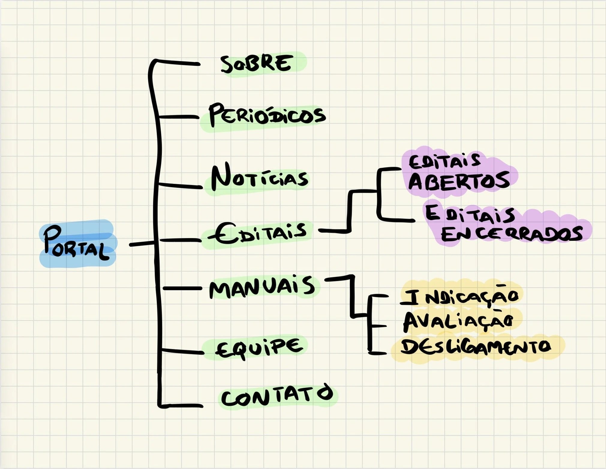
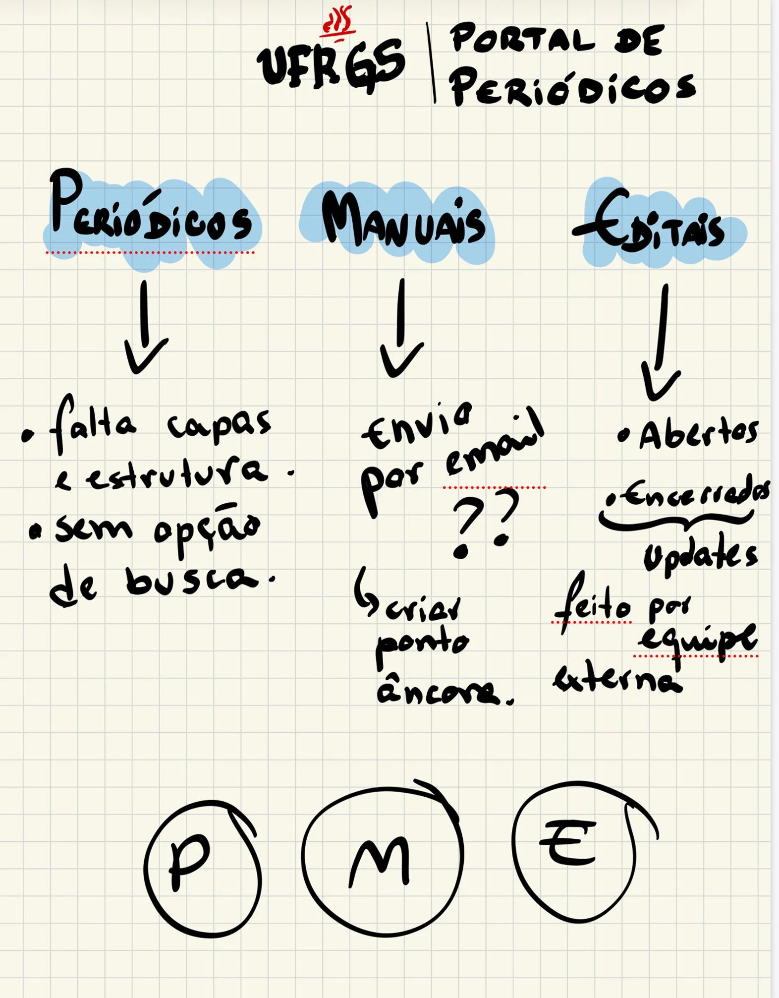
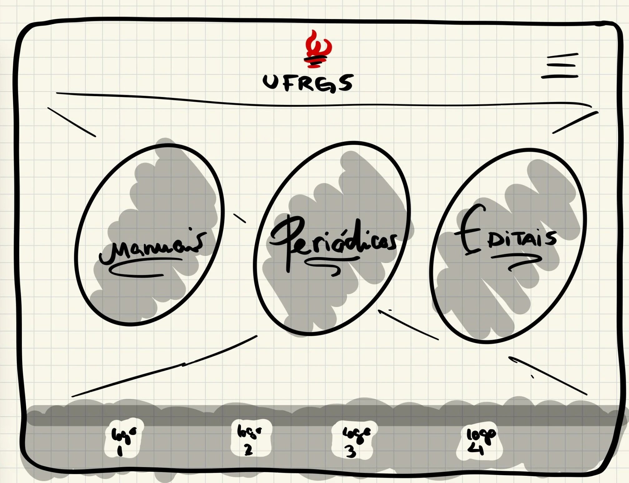
From there, I mapped the full website structure, defining three core areas: Scientific Periodicals, Manuals, and News & Editais. I worked through early flows and layouts in Illustrator, iterating on navigation patterns and content hierarchy until the architecture felt natural and the visual weight was right.
Each iteration was guided by one question: does this make it faster for a researcher to find what they need?
04. Solution
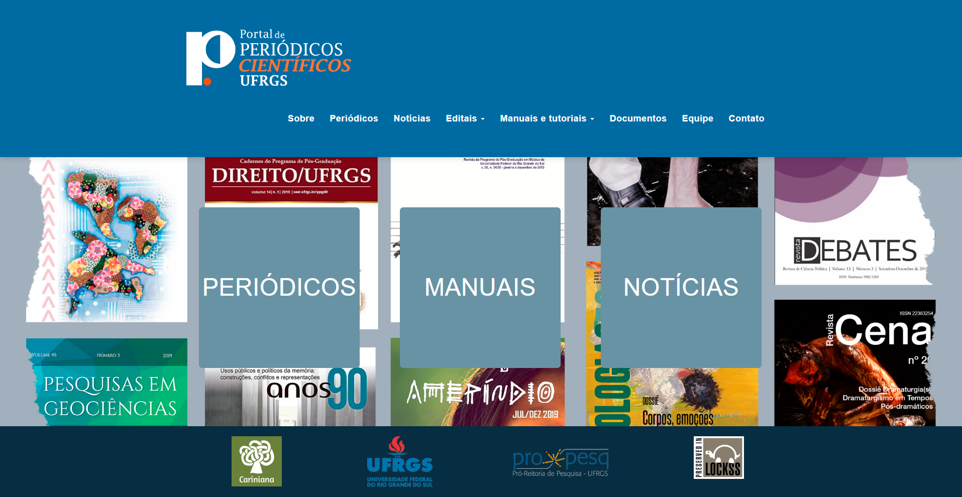
Structured, content-driven design
I designed every page of the platform, homepage, Scientific Periodicals, Manuals, News, About, Contact, and all supporting pages, ensuring a consistent visual language and coherent experience across the entire site. Working closely with a team of developers and front-end engineers, I handed off detailed visual specs and stayed involved throughout implementation to ensure the design intent came through.
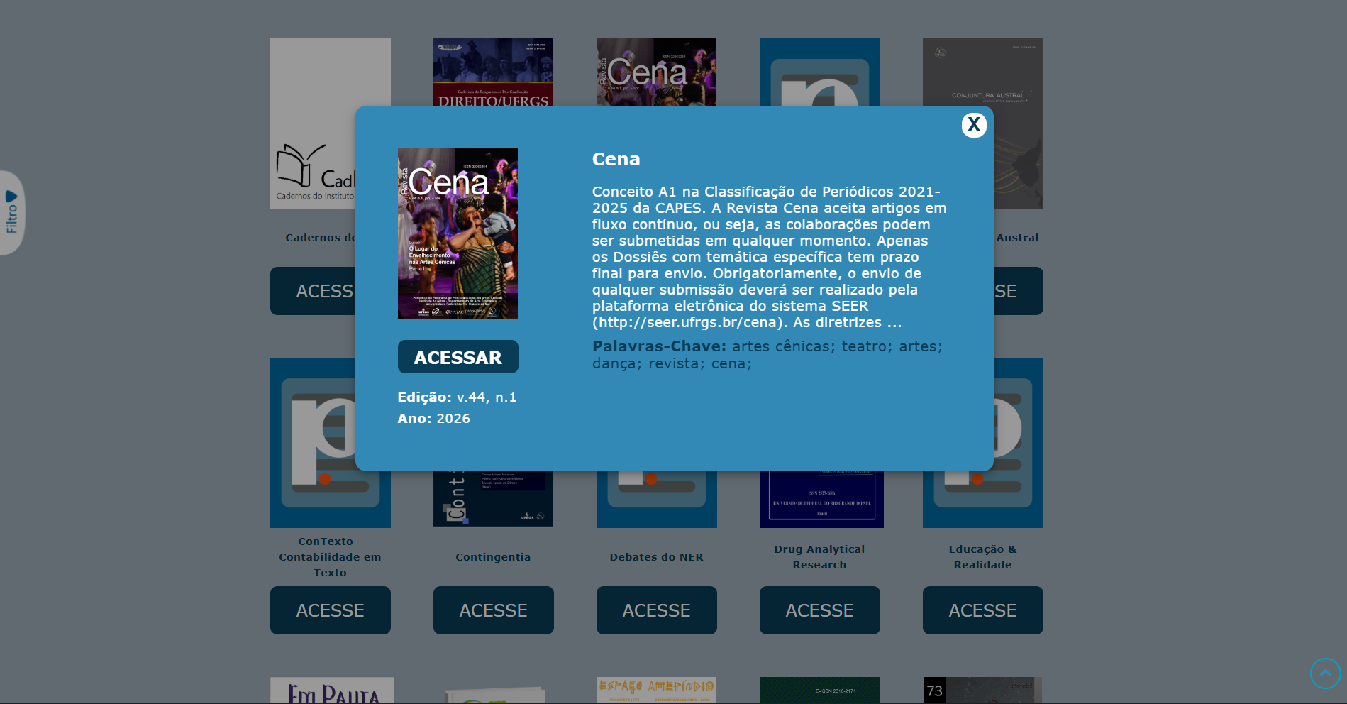
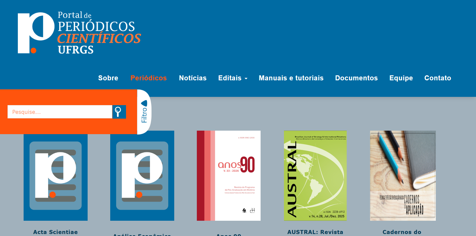
The Periodicals page became the centrepiece, a filterable hub for journals and publications, with theme and keyword filtering, improved browsing, and better visual hierarchy for journal content. The homepage was rebuilt to surface the latest news, editais, and publications at a glance, with direct paths into each main section.
Large datasets, SEER journals, articles, magazines, were reorganized with categorization and scannable summaries, turning a wall of content into something browseable.
From fragmented and overwhelming → structured and discoverable.
05. Outcome
Clearer, faster, more accessible
The platform went live with a structure that researchers can actually use. The changes were visible immediately — both in the organization of the site and in how academic content is presented and updated.
✓ A complete website design — every page, from homepage to About and Contact — with a consistent visual language throughout
✓ Easier navigation across academic content through a unified three-section architecture
✓ Improved visibility of journal publications through a dedicated, filterable hub
✓ A new logo giving the platform a distinct and credible identity
✓ A pattern system providing visual consistency across platform covers and materials
✓ Better, faster access to updated news and editais via a structured homepage
06.Learnings
What this project reinforced
01
Content-heavy platforms live or die by their information architecture. Visual polish comes second — structure always comes first.
02
Academic users value efficiency and trust above all else. The design's job is to get out of the way and let the content speak.
03
Early conversations with real users uncover problems that assumptions never would. Research is not a phase, it's the foundation.
04
Designing a system is only half the work. Staying involved through implementation, and documenting decisions clearly, is what protects the design from drifting during handoff.
07. If I returned to this
What I'd do differently
This is the project I've grown the most since, and looking at it now, with more distance and experience, three things stand out that I'd approach differently today.
Color
I'd completely rethink the palette. Blue dominates every surface , from header, background, buttons, to modal, and sidebar , and it overloads the reader instead of guiding them. I'd reduce it to an accent, bring in much more white space, and let the journal covers provide the visual richness. The content is colorful enough. The interface should step back.
The homepage entry points
My original design had a blurred, atmospheric background, a study setting, with an opacity layer over it before the three entry points. It gave the page warmth and context. During development, that was replaced with a flat mosaic of covers and plain overlay boxes, which lost a lot of the intent. This was a reminder that design decisions need to be defended through implementation, not just handed off in a file.
The journal grid
I'd add more depth and visual hierarchy to how journals are presented, subtle shadows, hover states, a cleaner card layout. The inconsistency in cover images was a known constraint: publication owners control their own covers and that was outside my scope. I documented a cover guidelines system for them, but adoption takes time. What I'd improve now is the fallback design, so the grid holds together even when covers are missing or inconsistent.